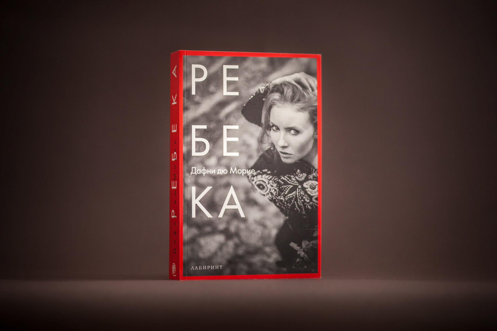
Designing for a Daphne du Maurier Book was exciting. Being a big Hitchcock fan made it double exciting. In my head there were only two ways to approach the assignment. One was to signal the respect and dignity that was due and therefore to take a “classics” approach and the other one was to try to position the book as if it was written yesterday. The genius of the author hasn’t dated so the editor agreed to a contemporary approach which had vintage nods. Having a strong eye contact picture was key for me so I spent a fair amount of time finding one. Using a font from a similar era as the book felt right so I decided to set it slightly off kilter in order to bring it out of the retro feel whilst the red border helped to elevate the black and white treatment and to underline the importance of the novel. This was the first of a series of reissues of du Maurier’s books and served as a guideline for the following designs.